
By Ryan Hammill
I am not sure what other fathers-to-be think about as they sit in hospital waiting rooms. With a pregnant wife still a few months out from delivery, already I have found myself sitting here on a number of occasions. And quite often, in between the periodic panic and wonder which trouble my boredom in the waiting room, I find myself thinking about the hospital’s sterile style.
Forgiving a hospital its sterile style is quite easy, even though the washed-out, buzzing fluorescence is a tad oppressive. After all, sterility—insofar as microorganisms are concerned—is integral to a hospital’s purpose. Once you notice the sterile style, however, you find that it follows you out of the hospital, where it is much harder to stomach.
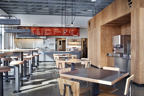
It follows you, for example, when you go get a burrito. Take that exemplar of the sterile style, Chipotle. It is far less forgivable here, especially since their recurrent E. Coli outbreaks have shown them to be quite incapable of cooking sterile food.
On the other hand, no known E. Coli outbreaks have been reported at my local pseudo-Italian family restaurant, Mucho Italiano. No outbreaks, though the dark carpet is stained with the past two decades of spilled beer, foot traffic, and the vomit of at least one inebriated student from the Catholic college up the road (this is pure conjecture—I’m sure it’s more than one). The walls have none of the sleek whiteness characteristic of industrial burrito production, covered as they are with paraphernalia from said college’s basketball team.
Chipotle is not sterile for sterility’s sake, as in a hospital. Chipotle’s sterility is stylistic. This is not to say unimportant. Stylistic sterility is rather more profound than functional sterility. Consider the feeling Chipotle elicits when you enter, compared to the feeling when you enter my local Mucho Italiano (dear reader, this is not it’s real name).
Entering Chipotle is entering into cool assurance—stainless steel, industrial simplicity, neutral colors. There’s no shame in being found here. Mucho Italiano provides neither coolness nor assurance. Splotchy carpet, fake rock paneling, and cracked vinyl seats. This is a place to take your grandfather on an obligatory lunch outing. This is no place to take a date.
The fact that differences in style can provoke such instantaneous, disparate, and emotional reactions reveals our mistake in ignoring or discounting style as the bastard younger brother to the legitimate “substance.” Style is substance.
Chipotle is, of course, not alone in mastery of the calm assurance that the sterile style imparts. More than perhaps any other company, Ikea has capitalized on the sterile style. They have simultaneously built the cheapest as well as the coolest furniture available to average consumers.
The blossoming of the sterile style is not limited, however to furniture and interior design. In fact, the sterile style extends to almost any cool brand you might name. Google is an instructive case. Take a look at their logo. From 1999 to 2015, it was based on the Catull serif typeface. Not only did it have serifs (the little edges hanging off the ends of letters), but it was also modulated. A modulated font has letters of varying thickness—it’s like writing with a fountain pen, where some pen strokes are thin and others thick. In addition to the dangling edges and sharp corners of the serifs, the inconsistent width of the strokes, the first (and longest-lasting) iteration of the Catull-based Google logo, which stood from 1999 to 2010, had a clearly distinct projected shadow. Looking back, it’s remarkable how uncool the old Google logo was. Of course, we thought it was cool at the time.
But everything changed on September 1, 2015. Google unveiled a new logo. The projected shadow was already out. But for the first time, Google went “sans,” i.e. sans (without) serifs. Further, stroke width was completely standardized. It became an unmodulated, or monolinear, font. No more dangling edges; no more inconsistency in thickness. This new logo, in fact, was made in a font proprietary to Google. I’ll leave you to ponder the significance of the font’s name: Product Sans.
Take a look around you—at the books and magazines on your desk, the logos on clothes, the storefronts and billboards outside. Now, note the level of coolness any given logo evokes in your mind. Before you can even consider how cool or uncool something is, your brain has already decided. Now, tally up how often those logos with sans-serif, monolinear fonts score high for cool, and how uncool those logos with serif, modulated fonts are. It’s impossible to unsee. Why is The Federalist cool and The Weekly Standard stodgy? I think you can tell me the reason. This is the sterile style.
Now, reach into your pocket. Like the generational progress of the Google logo, the increased sleekness of the iPhone is the fruit of the sterile style. Yes, the ever-decreasing size of transistors makes more computing power and less heft possible, but it doesn’t mean you need to cut down on the already few number of buttons, eliminate the headphone jack, and use wireless charging. These features are functional, but they’re just as much stylistic—it’s almost as if Apple is shearing the serifs off their devices, making them monolinear: sleeker, cleaner, cooler.
That Chipotle, Ikea, Google, and Apple all share an aesthetic of cool sleekness is obvious. Undeniable even. But what am I getting at by calling this sleekness “sterile”? Is it just kind of like a hospital, or is there something more going on?
The central meaning of the sterile style is self-containment. The iPhone becomes progressively cooler as it approaches the appearance of a single polished shard of glass, beveled and black and rounded and feature-less. Monolinear, sans-serif font is fundamental to the sense of self-containment: a single, simple system coherent within and for itself, unaffected by outside considerations. Ikea furniture is composed of planes at right angles to each other, simple waves, solid colors, and two-tone patterns. There is very little ornamentation or complexity—and that’s the appeal.
By contrast, Mucho Italiano is not sterile, not self-contained. And it won’t be until it rips up its weathered carpet to which clings the dust of decades, and removes the basketball jerseys hanging on its walls, which give it a particularity dependent on some other place, upon some other people. Its endless, Cheesecake Factory-like efflorescence of menu items is further evidence of its lack of one singular, unifying principle which might make it a self-contained, coherent system.
Rather than being sufficient unto itself, Mucho Italiano is random, unexpected, rough around the edges (rather than smooth, like an iPhone, like Chipotle). Its style, whatever it is, is uncool. Chipotle’s sterile style is cool—as are the Bay Area’s dozens of coffee shops with polished concrete floors, industrial furniture, clean lines, and sans-serif, monolinear font.
And yet this article, by title, claims to be “Against the Sterile Style.” What’s wrong with sterility?
The central problem with the Sterile, a problem unique to it—because this is in the very nature of the Sterile—is that it cannot produce anything beyond itself. It has stripped itself of all ornamentation. It has deliberately cut itself off from any outside source. It is self-contained, but it is not self-sustaining. It cannot bring forth life. It ends, ultimately, in anti-humanism.
Consider just how uncomfortable it is to sit inside a Chipotle. The chairs are hard, the floor is hard, the ceiling is high so the room is frigid, and the sound is cacophonous as it bounces around the tomb-like room. Cool indeed. This is no place to linger for a family, or anyone for that matter.
Mucho Italiano, on the other hand, might be uncool, but it is at least comfortable. I can sit with my friends or my family for an hour or two on the plush, vinyl seats. The low ceiling and the carpet soften the noise, so I can hear, and be heard. And while the jerseys hanging on the wall might be tacky, the connection to a place is real, unlike at Applebee’s, where it is feigned, and very much unlike at Chipotle, where it is not even pretended. Most times that I go to Mucho Italiano with my friends during basketball season, our waiter offers us free tickets to the game.
Being itself is ultimately not sterile. That’s the problem with the sterile style—it is a lie. We are not self-contained, sufficient unto ourselves. Admittedly, that has not stopped us from trying to make childbearing an essentially sterile task: a quest that must reach its apotheosis in the abomination of cloning. And many think nothing of sterilizing themselves temporarily if not permanently—a treatment on offer from our hospital, where my wife and I might be cured of our early onset of pregnancy disease.
To be against the sterile style is to be against sterility itself. And anyone who can see what is obvious—life depends on other Life, being depends on some other Being—must oppose sterility. Opposing the sterile style, however, is not primarily a negative, or oppositional task. It is, rather, a positive, constructive task. We are searching for a new style, one that is vital, fertile with life’s florid energy. We will need artists, and poets, and musicians, and critics, and philosophers.
In the meantime, I am just hoping Mucho Italiano doesn’t try to become cool.
Ryan Hammill lives in the San Francisco Bay Area. He works in marketing and enjoys studying Latin, architecture, and the history of ideas. His writing has also appeared in Sojourners magazine, The Federalist, and Aleteia.
Enjoy the article? Pay the writer.
$ Donation Amount:Donate NowSelect Payment Method
- PayPal
Personal Info
First Name *
Last Name
Email Address *
Donation Total: $0
The Weekly Digest
Premier Thought Every Thursday.
All of our recent essays and podcasts, delivered to you. Free.
Free. Delivered Thursday mornings.
